Showing posts with label visualization. Show all posts

Wednesday, 12 November 2014

Demographic history and Mortality heatmaps

Turbulent events of history leave sharp marks in demographic structure. Demographic history could tell us a lot about historical events...providing we could get necessary data. Demographic portal recently start offering access to relatively long time series for a broad range of countries. It also offers possibility to construct heatmaps of mortality changes (detailed description is available in Russian), which is an excellent tool for tracking historical changes.

Chart for Russia 1959-2010 (male) is clearly shows heavy impact of 1990s. The blood-red spot shows increased mortality in all ages, especially in working age--consequences of transitional shock.  One could also note positive impact of Gorbachev's anti-alcohol campaign, a blue spot around 1985. It shows declining mortality of working age men. Unfortunately campaign was not long enough (and not very well implemented).

russia-mortality-map

France 1900-2010 clearly shows two red cradles of mortality hikes during WWI and WWII and more or less monotonous decline of mortality for the rest of period.

france-mortality-map


Original of post at my personal page.

Sunday, 14 September 2014

Food basket a century ago: Great Britain vs Russia

Infographics was born in the very exact moment when prehistoric man drew on the wall of the cave a buffalo and hunters, explaining something to his fellow tribesmen. Most probably, they have now proper language, but inforgraphics was already there. The years passed. At the turn of the last century, in 1912, the publishing house «Vestnik Zaninija» in St. Petersburg has published the book «Rossija v cifrah. Strana. Narod. Soslovija. Klassy» (i.e. «Russia in the figures. Country. People. Estates. Classes») authored by Nikolai Alexandrovich Rubakin. The book contains various statistical data on what was then the Russian Empire, as well as comparisons with other countries of the then World. It provides in particular revealing picture on weekly family budgets of English manual laborer (a family of 3 persons and an annual budget of 450 rubles) and locksmith from Nizhny Novgorod (family of 3 persons and an annual budget of 400 rubles).


Chart is in Russian, but it is easily understandable. English manual laborer is on left side and locksmith from Nizhny Novgorod is on right side. Labels from top to bottom reads as the following:
  • Tea 1/2 lb vs 1/10 lb
  • Butter 1 lb vs 1/2 lb
  • Sugar 4 1/2 lb vs 2 1/2 lb
  • Vegetable oil nil vs 3 lb
  • Meat and lard 4 1/2 lb vs 3 1/2 lb
  • Potatoes 8 lb vs 10 lb
  • Vegetables (cost) 4 kop. vs 10 kop. (100 kop. = 1 ruble)
  • White bread and flour 19 1/2 lb vs 19 lb
  • Back bread  nil vs 14 lb


Original of post at my personal page.

Friday, 3 August 2012

Indicators, Human Development and .. Shrek

Have you ever tried to explain indicators and human development to .. kids? How soon did they fall asleep? Explaining complex things, like human development measurement, in simple language is hard but very necessary. During Summer University Course on Sustainable Human Development in CEU, Budapest we paid specific attention to measurement issues. This year we experimented and called for ... Shrek story to explain indicators.


Slides are available on-line

Wednesday, 12 October 2011

OECD Better Life Index

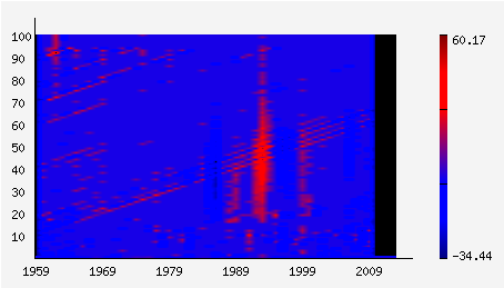
Numerous laces had been broken in debates how to measure «quality of life». The first problem we face, trying to measure the «quality» of our lives, is diversity and complexity of life. It is difficult to make and, moreover, to agree on a common list of areas and indicators in each area of quality of life. And it is even more difficult to squeeze all the diversity of life in one index, which is still necessary for any comparisons.

The second, less visible but more important issue-each of us differently value different aspects of life. For some, the incomes are of greatest value, while another pays more attention to decent work, and someone else put above all support from friends and family... Scientific, justified choice of «weights» for each area is a rather tricky task. The arbitrary choice of weight is in fact a political statement, to which occurs quite rarely. That is why most of the composite indices use equal weights for their dimensions-Human Development Index, Multidimensional Poverty Index, Multidimensional Social Exclusion Index. (Interestingly, in a recent paper, the authors obtained almost equal weights for the components of the Human Development Index , analyzing the data for the period 1975-2005)

OECD has found a very interesting approach to these issues in its «Better Life Index». First, they defined a list of areas from the «usual suspects» (housing, income, work safety, a total of 11 regions). Then they allowed users to decide on importance of each area (on a scale from 0 «not important» to 5 «very important»). Index itself is visualized for each of 34 countries in the form of a flower: petal size correspond to the each area, while the flower height-to composite index, taking into account the importances set by ​​the user.

Consideration of the quality of life is not limited to one composite index, you can see in detail how things look like in each area, such as support from the community. The most meticulous can reach up to full list of indicators and underlying data, used to calculate the index.

Ability to choose the importance of each area allows users to move away from the question «who is number 1?» and turn to more important question—how each of the 11 topics can contribute to overall well-being? Sure, we’ll see many more debates, «how to measure quality of life», but now everyone can do their research and take part in debates.


This post is also available in Russian